
Which MLB Stadiums Are Closest to Downtown? Complete Distance Analysis
As a baseball fan and data enthusiast, I've often wondered about the geographic positioning of Major League Baseball stadiums relative to their city centers. How far do fans typically travel from downtown to attend games? Which teams offer the most urban experience, and which require a journey outside the city center?
To answer these questions, I created a comprehensive data visualization that maps MLB ballpark distances from downtown using Python and the Google Maps API. This project reveals fascinating insights about stadium locations and their impact on the fan experience.
MLB Ballpark Locations Map: Downtown Distance Comparison
Creating this visualization required a systematic approach to data collection, processing, and visualization. Here's how I brought this project to life:
1. Data Collection and Preparation
The first step involved gathering precise geographical data for:
- MLB Stadium Locations: Collecting accurate latitude and longitude coordinates for all 30 Major League Baseball stadiums
- Downtown Coordinates: Identifying the geographic centers of each corresponding metropolitan area
This foundational data provided the necessary inputs for calculating meaningful distance metrics.
2. Leveraging the Google Maps API
The Google Maps API proved invaluable for this analysis, allowing me to:
- Calculate precise travel distances between each stadium and its nearest downtown
- Determine the directional relationship (north, south, east, west, etc.) between points
- Account for real-world travel considerations rather than simple straight-line distances
The API integration provided rich geographical context that simple coordinate-based calculations would have missed.
3. Python-Powered Data Processing
With Python as my primary tool, I processed the raw geographical data to extract meaningful insights about each stadium's position relative to its city center. This involved calculating both the distance and directional components, then organizing the data in a format suitable for visualization.
This programming approach allowed for efficient processing of multiple geographical data points while maintaining analytical rigor.
4. Visualization with Matplotlib
The final step involved transforming the processed data into a visually compelling representation using Python's Matplotlib library:
- Created dual radial plots to show both distance and direction from downtown
- Used team logos instead of simple data points to create an intuitive, fan-friendly visualization
- Implemented distance rings at regular intervals to provide clear spatial context
- Included cardinal directions (N, S, E, W) for orientation
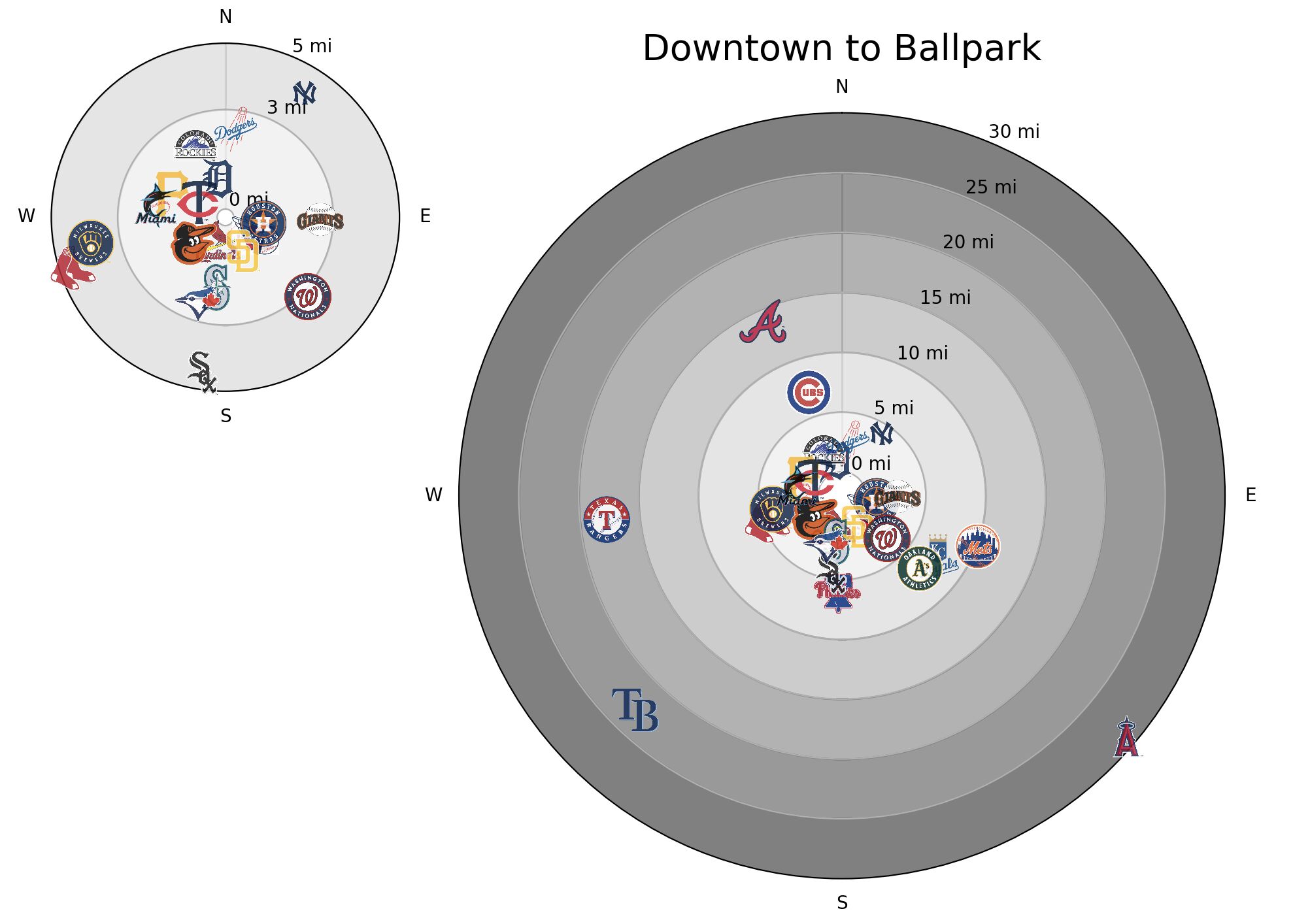
The resulting visualization, shown below, provides an immediate, intuitive understanding of stadium positioning that raw data alone couldn't convey:
As you can see in the visualization, I created two complementary views:
- A detailed view (left) showing the closer stadiums within 5 miles of downtown
- A comprehensive view (right) displaying all stadiums with concentric rings extending to 30 miles
Best and Worst MLB Stadium Locations: Urban vs. Suburban Ballparks
This data visualization reveals several interesting patterns about MLB ballpark locations:
Urban vs. Suburban Stadium Experiences
There's a significant variation in how integrated MLB stadiums are with their city centers:
- Downtown-Centric Teams: Several franchises like the Detroit Tigers, St. Louis Cardinals, and Houston Astros are positioned very close to their downtown cores, offering genuinely urban ballpark experiences
- Moderate Distance Teams: Teams like the Chicago Cubs (appearing around the 5-mile ring) offer a balance between urban integration and residential accessibility
- Suburban Outposts: Teams like the Texas Rangers, Tampa Bay Rays, and Los Angeles Angels have opted for locations significantly removed from metropolitan centers, appearing in the outer rings of the visualization
These location differences fundamentally change the game-day experience for fans, from transportation options to pre and post-game activities.
Directional Clustering
The visualization reveals interesting directional patterns:
- Northern Locations: The New York Yankees appear north of their downtown
- Southern Positions: The Chicago White Sox and Washington Nationals tend to be south of their city centers
- Eastern Placements: Teams like the Pittsburgh Pirates and San Diego Padres appear east of downtown
- Western Locations: The Boston Red Sox and Seattle Mariners are positioned to the west of their downtowns
These directional relationships reflect historical city development patterns, geographical constraints (like rivers or coastlines), and urban planning decisions.
Regional Patterns
The visualization also highlights interesting geographical trends across baseball divisions and regions:
- Northeast Corridor: Generally features more urban-integrated ballparks
- Southern and Western Expansions: Tend to have more suburban stadium placements
- Historical vs. Modern Stadiums: Older franchises often maintain more centrally-located facilities
These patterns reflect both historical development decisions and more recent trends in stadium construction.
MLB Stadium Access Guide: Distance Impact on Fan Experience
The distances visualized directly impact fan experiences in several ways:
- Public Transportation Access: Downtown-adjacent stadiums typically offer more robust public transit options
- Parking and Traffic Management: Suburban locations often provide more abundant parking but may face congestion challenges
- Game-Day Economy: The geographical relationship between stadiums and downtowns influences where fans spend money before and after games
Understanding these relationships provides valuable context for both fans planning game attendance and cities considering economic development around sports venues.
While this visualization focuses specifically on MLB ballparks, the same analytical approach could be applied to other sports leagues and venues:
- Cross-Sport Comparisons: How do MLB stadium locations compare to NBA arenas or NFL stadiums?
- International Baseball: Extending the analysis to include Japanese NPB or Korean KBO stadiums
- Historical Trends: Analyzing how stadium locations have evolved over baseball's history
Each of these extensions would provide additional context for understanding the relationship between sports venues and urban centers.
Future of MLB Stadium Locations: Trends and Predictions
Looking ahead, several emerging trends may influence future MLB stadium locations:
- Urban Revitalization Projects: More cities are exploring downtown stadium developments as catalysts for urban renewal
- Transit-Oriented Development: Future stadiums may prioritize integration with expanding public transportation networks
- Mixed-Use Complexes: The next generation of stadiums will likely incorporate more year-round entertainment, retail, and residential components
- Sustainability Considerations: Environmental factors may influence stadium placements, with emphasis on reducing carbon footprints and promoting sustainable transportation
Teams currently in aging facilities like the Oakland Athletics and Tampa Bay Rays will make location decisions that could either reinforce or challenge the patterns observed in this analysis.
Conclusion: Data Visualization in Sports Analysis
This project demonstrates the power of combining programming skills with sports data to generate meaningful insights. By visualizing MLB ballpark distances from downtown areas, we gain a better understanding of:
- The geographical landscape of America's pastime
- How stadium location influences the fan experience
- Regional differences in stadium development approaches
While my day job primarily involves software development for Guidewire, this side project showcases how Python and data visualization techniques can uncover fascinating patterns in sports geography.
For baseball fans planning their next stadium visit, this visualization offers practical insights into what to expect regarding location and accessibility. For urban planners and sports franchises, it provides a comparative view of how different teams have positioned themselves geographically relative to their city centers.
Would you be interested in seeing similar analyses for other sports leagues? Or perhaps a deeper dive into how these stadium distances correlate with attendance figures or local economic impact? Let me know in the comments!
Python Data Visualization Tools for Sports Analysis: Step-by-Step Guide
If you're interested in creating similar visualizations, here are the key tools I used:
- Python for data processing and visualization
- Google Maps API for geographical calculations
- Matplotlib for creating the visual representation
- Pandas for data manipulation
With these tools and the right geographical data, you can create your own insightful sports analytics visualizations.
Transform Your Business With Custom Data Visualization
Impressed by what data visualization can reveal about baseball stadiums? Imagine what similar analysis could uncover about your business operations, customer patterns, or market positioning.
As a Dallas-Fort Worth technology consultant, I help local businesses leverage custom data visualization and analysis to gain competitive advantages and make data-driven decisions. From identifying geographical customer patterns to visualizing operational efficiencies, the same techniques demonstrated in this MLB analysis can be applied to your business challenges.
Let's discuss how custom data analysis can provide the insights you need to optimize your Dallas business operations and drive growth through informed decision-making.